Property Controls
This page is from before the launch of Framer X22. Since X22 we can use Function Components (read about them here), and the text below is about the property controls in Class Components. Class Components still work in Framer but are more complicated to write.
Contents
- How to add a Property Control
- Multiple items
- String
- Color
- Image
- Number
- File
- Boolean
- Enum
- Segmented Enum
- Fused Number
With property controls you can add custom properties to Framer’s UI.
When you create a button component, for instance, you can make it possible to quickly change the button’s label and color, directly in the Properties Panel.
This button would use a String control for the button label, and a Color control for the button’s color. But there are more types:
- String — A text string of any length
- Color — A color picker, the color can have an alpha value
- Image — An image that gets added to the project folder
- Number — Any number, positive or negative, also decimals
- File — A file that gets added to the project, you pick which type it should be
- Boolean — A yes/no, on/off, true/false value
- Enum — A pop-up menu with a list of options to pick from
- Segmented Enum — Same as Enum, but with the different options presented next to each other
- Fused Number — One global number, or four distinct numbers, like when setting the Radius or Border of a frame
The project below contains an example code component for each type of property control.
How to add a Property Control
Property Controls are not a part of React, so you need to import a few things from the Framer Library.
import { PropertyControls, ControlType } from "framer";PropertyControls, a TypeScript type, defines how a set of property controls should look, and ControlType contains the details of all possible types of controls.
In a TypeScript interface called Props you first set the properties you want to use. You set the type of each property so that VS Code knows what to check for.
Here’s an example with the button from above: We have a buttonText property for the label and a buttonColor for its color. For both of them, the TypeScript type is string.
interface Props {
  buttonText: string;
  buttonColor: string;
}
Then in the component class you set their default values (while also passing along the Props between < >) :
export class MyButton extends React.Component<Props> {

  // Set default properties
  static defaultProps = {
    buttonText: "Start",
    buttonColor: "#1199EE"
  };
  ...
And also inside the class, you add another static object named propertyControls (of type PropertyControls), in which you define how the controls should look in the Properties Panel.
For each property (here buttonText and buttonColor) you write an object which its settings.
Inside each object, you specify the type of the desired control and other properties like the title it should have in the UI, or the placeholder text for when the input field is empty.
  ...

  // Items shown in property panel
  static propertyControls: PropertyControls = {
    buttonText: {
      type: ControlType.String,
      title: "Button label",
      placeholder: "Type the button's text"
    },
    buttonColor: {
      type: ControlType.Color,
      title: "Button color",
      defaultValue: "#1199EE"
    }
  };

  ...
Different controls have different properties. They all have a title property, but that one’s actually optional. When omitted the UI will just show the name of the property.
(Most property controls have a defaultValue property. I always add it in these examples, but you can omit it because you will have set the static defaultProps anyway.)
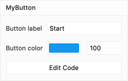
The result in the Properties Panel:
Inside the render() function you can then use the properties, they will be inside this.props.
In this example I use this.props.buttonColor to set the background of the <button>. And the label,this.props.buttonText, is used as the <button>‘s contents.
  ...

  render() {
    return (
      <button style={{ background: this.props.buttonColor }}>
        {this.props.buttonText}
      </button>
    );
  }
}
Which results in this on the Canvas:

Multiple items
You can also let the user add several items.
As an example: instead of just one text string, you can let the user enter several strings, as much as they want.
In this case, your property would not be a string, but an array of strings.
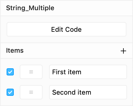
The items can be reordered by dragging them, and you can activate or deactivate them with checkboxes.
For this, you use the ControlType.Array property control, and for its propertyControl you give it another object (here a ControlType.String).
  static propertyControls: PropertyControls = {
    items: {
      type: ControlType.Array,
      title: "Items",
      propertyControl: {
        type: ControlType.String,
        placeholder: "Type name",
        defaultValue: "New item"
      },
      defaultValue: ["First item", "Second item"],
      maxCount: 5
    }
  };
It’s not limited to Strings, of course, you can also use Colors, Images, Numbers, Files, and Boolean values.
A ControlType.Array, like all the others, can have a title, and you can give it a defaultValue (which of course should now be an array of values).
You can limit the number of items a user can add by setting maxCount.
ControlType.Array
| Property | Type | Required |
|---|---|---|
title | String | – |
defaultValue | Array | – |
propertyControl | Object | ✔️ |
maxCount | Number | – |
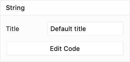
String
Plain and simple, the ControlType.String property control lets you enter a string of text, like for instance a ‘Title’:
Obviously, the TypeScript type in the Props interface should be… string.
interface Props {
  title: string;
}
Inside the component’s class you set title’s default value:
  static defaultProps = {
    title: "Default title"
  };
… and you define how title’s property control should look:
  static propertyControls: PropertyControls = {
    title: {
      type: ControlType.String,
      title: "Title",
      placeholder: "Set title",
      defaultValue: "Default title"
    }
  };
You can set a defaultValue (again, you might as well omit this one, you’ve already set it above), the title that should be shown in Framer’s UI, and a placeholder text that is displayed when no text is entered.
ControlType.String
| Property | Type | Required |
|---|---|---|
title | String | – |
defaultValue | String | – |
placeholder | String | – |
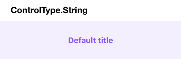
In the example component, I just render the text in a <h2> header.
  render() {
    return (
      <div style={divStyle}>
        <h2>{this.props.title}</h2>
      </div>
    );
  }
You’ll see that the .jsx file contains a style object, divStyle, that is applied to the <div> that contains the <h2> with the text.
On the Canvas it looks like this:
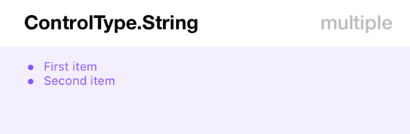
Multiple Strings
A list of strings is also possible:
I named the property items, and for ControlType.Array the TypeScript type annotation should be: ‘an array of strings.’
interface Props {
  items: Array<string>;
}
The defaultProps I set for items contains, predictably, an array of strings.
  static defaultProps = {
    items: ["First item", "Second item"]
  };
Optionally you can also set a defaultValue on the ControlType.String itself (here "New item"), which will be the initial value of each newly added text string.
  static propertyControls: PropertyControls = {
    items: {
      type: ControlType.Array,
      title: "Items",
      propertyControl: {
        type: ControlType.String,
        placeholder: "Type name",
        defaultValue: "New item"
      },
      defaultValue: ["First item", "Second item"],
      maxCount: 5
    }
  };
And in this example, a maxCount is set. The user can add a maximum of 5 strings.
To render the text strings I use an <ul> (unordered list). And I map() through the items inside this.props.items to create multiple <li>’s.
  render() {
    return (
      <div style={divStyle}>
        <ul>
          {this.props.items.map((item, index) => (
            <li key={index}>{item}</li>
          ))}
        </ul>
      </div>
    );
  }
Whenever you have a list of things, React will mention that they need to have a key. (But you might not even notice the error message in the Console. More info.) So I added a key attribute to the <li>. It’s simply the index number that the map() function provides, which is good enough.
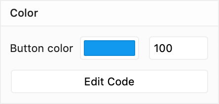
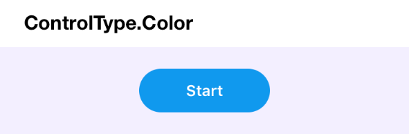
Color
The color control will show a color picker, with a number field next to it for the color’s alpha value.
There’s no specific ‘color’ object in JavaScript, so the type of this buttonColor property should be string.
interface Props {
  buttonColor: string;
}
The default value is also written as a string, between " ". You can use any CSS color format (HEX, RGB, HSL, named color,…).
  static defaultProps = {
    buttonColor: "#1199EE"
  };
In the description of the control, you can optionally add a title and a defaultValue.
  static propertyControls: PropertyControls = {
    buttonColor: {
      type: ControlType.Color,
      title: "Button color",
      defaultValue: "#1199EE"
    }
  };
ControlType.Color
| Property | Type | Required |
|---|---|---|
title | String | – |
defaultValue | String | – |
My render() function contains a <button>, on which I set the CSS background property (combined with CSS properties I already had defined in buttonStyle).
  render() {
    return (
      <div style={divStyle}>
        <button
          style={{
            ...buttonStyle,
            background: this.props.buttonColor
          }}
        >
          Start
        </button>
      </div>
    );
  }
By the way, those three dots ... is the ES6 spread operator.
It spreads out the CSS properties contained in buttonStyle so that they can merge together with the background property in one single object that contains all the CSS properties.
The spread operator also works with arrays. Here’s an introduction with some examples.
Multiple Colors
Also possible: a list of colors. They can activated and deactivated with their checkboxes, and also reordered.
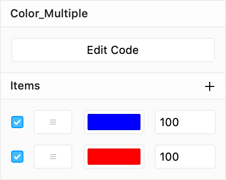
The interface for the items property is again an array of strings.
interface Props {
  items: Array<string>;
}
And I used a few CSS ‘named colors’ as the default values.
  static defaultProps = {
    items: ["Blue", "Red"]
  };
The maximum amount of colors is set to 3, and the initial defaultValue for a newly added color is "#1199EE".
static propertyControls: PropertyControls = {
items: {
type: ControlType.Array,
title: "Items",
propertyControl: {
type: ControlType.Color,
defaultValue: "#1199EE"
},
maxCount: 3,
defaultValue: ["Blue", "Red"]
}
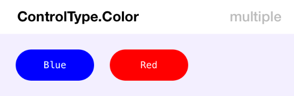
};In the render() function, I create a <div> for every color swatch with the map() function. Each of them needs to have a unique key.
  render() {
    return (
      <div style={divStyle}>
        {this.props.items.map((color, index) => (
          <div
            key={index}
            style={{
              ...swatchStyle,
              background: color
            }}
          >
            {color}
          </div>
        ))}
      </div>
    );
  }
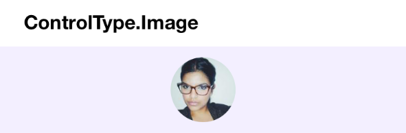
Image
The image control shows a small image picker, like this:
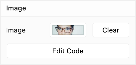
The type for the property (here simply: image) should be string, because it will contain a (local, absolute) URL to the image file.
interface Props {
  image: string;
}
The image file (JPG, PNG or (animated) GIF) will be saved in an assets folder inside the design folder. (Select Show Project Folder in the File menu (⌥⌘P) to find it.)
We can’t set a default image file, so the default prop can just be null (or an empty string: "").
  static defaultProps = {
    image: null
  };
The configuration options are limited. You can only set the title you want to see in Framer’s UI.
  static propertyControls: PropertyControls = {
    image: {
      type: ControlType.Image,
      title: "Image"
    }
  };
ControlType.Image
| Property | Type | Required |
|---|---|---|
title | String | – |
In the render() I placed an <img>, which its src (source) set to the URL in this.props.image.
  render() {
    return (
      <div style={divStyle}>
        <img src={this.props.image} style={imageStyle} />
      </div>
    );
  }
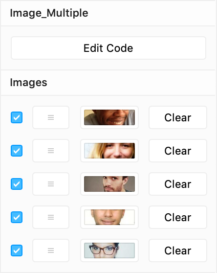
Multiple Images
A list of images that you can reorder is also possible.
More images, so instead of just one string, now an Array of strings.
interface Props {
  images: Array<string>;
}
We can’t set default images, but we know they will be in an array: []
  static defaultProps = {
    images: []
  };
I have set a maxcount of 5 images in this example.
  static propertyControls: PropertyControls = {
    images: {
      type: ControlType.Array,
      title: "Images",
      propertyControl: {
        type: ControlType.Image
      },
      maxCount: 5
    }
  };
And with map(), I create an <img> (with a key) for every item in the this.props.images array.
  render() {
    return (
      <div style={divStyle}>
        {this.props.images.map((image, index) => (
          <img key={index} src={image} style={imageStyle} />
        ))}
      </div>
    );
  }
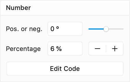
Number
My example component contains two distinct number controls, to illustrate that you can have a slider, but also a stepper.
The two numeric properties: negativeOrPositive and steppable, should, naturally, be of type number.
interface Props {
  negativeOrPositive: number;
  steppable: number;
}
Their default values in defaultProps:
  static defaultProps = {
    negativeOrPositive: 0,
    steppable: 6
  }
You can constrain the accepted input with min and max properties. When not defined the default values of 0 and 100 will be used.
  static propertyControls: PropertyControls = {
    negativeOrPositive: {
      type: ControlType.Number,
      title: "Pos. or neg.",
      defaultValue: 0,
      unit: " º",
      min: -50,
      max: 50,
      step: 0.1
    },
    steppable: {
      type: ControlType.Number,
      title: "Percentage",
      defaultValue: 6,
      unit: " %",
      min: 0,
      max: 100,
      step: 10,
      displayStepper: true
    }
  };
By default, you will get a slider control. Set displayStepper to true to display a large step control instead.
The step property defines the jump value for the small step control next to the number (with up/down buttons) and is unrelated to the behavior of the big stepper. The big stepper will always increment or decrement with 1.
By default, this control only accepts whole numbers (integers). Set the step size to a value smaller than 1 (like, e.g. 0.1 above) to let the user enter decimal values.
The string you set on unit (here " º" and " %") will be shown in the UI after the number.
ControlType.Number
| Property | Type | Required |
|---|---|---|
title | String | – |
defaultValue | Number | – |
min | Number | – |
max | Number | – |
unit | String | – |
step | Number | – |
displayStepper | Boolean | – |
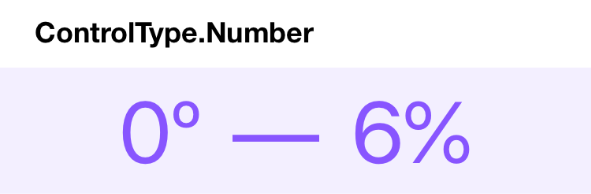
Nothing special happens in the render(). The props are shown in a <span>, and I stick º after this.props.negativeOrPositive and % after this.props.steppable.
  render() {
    return (
      <div style={divStyle}>
        <p>
          <span style={spanStyle}>{this.props.negativeOrPositive}º</span>
          <span style={spanStyle}>—</span>
          <span style={spanStyle}>{this.props.steppable}%</span>
        </p>
      </div>
    );
  }
Multiple Numbers
Also possible: an array of numbers.
The needed TypeScript typing: an Array of numbers.
interface Props {
values: Array<number>;
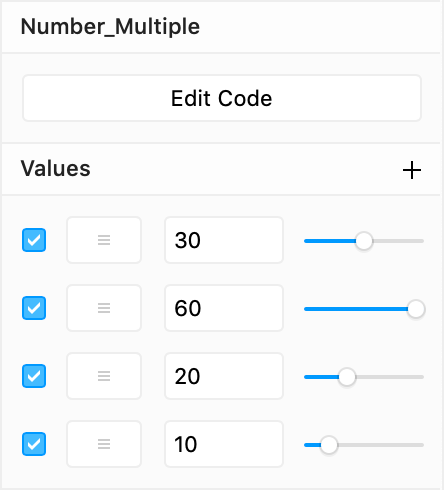
}Our values property has an array of four numbers as its default value.
  static defaultProps = {
    values: [30, 60, 20, 10]
  };
I limited the maxCount to 8 numbers, and when a new number is added its initial value (defaultValue) will be 30.
static propertyControls: PropertyControls = {
values: {
type: ControlType.Array,
title: "Values",
propertyControl: {
type: ControlType.Number,
max: 60,
defaultValue: 30
},
defaultValue: [30, 60, 20, 10],
maxCount: 8
}
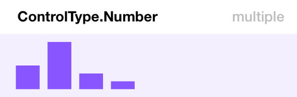
};The values in the this.props.values array are used as the height of as many bars. They are simple <div>s of which I change their height property.
  render() {
    return (
      <div style={divStyle}>
        {this.props.values.map((value, index) => (
          <div
            key={index}
            style={{
              ...barStyle,
              height: value
            }}
          />
        ))}
      </div>
    );
  }
File
Files are also possible. You can even define which type(s) of files can be selected.
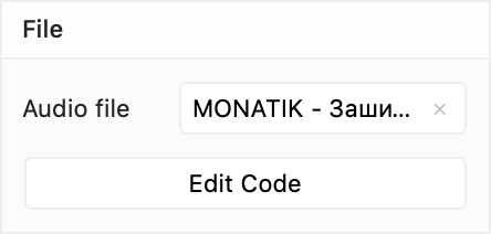
Just like with Images, Framer will save the selected file inside the project and provides you a local (absolute) URL to it.
An URL, this means that the property will be of type string. In this example, I named it audiofile.
interface Props {
  audiofile: string;
}
We can’t include a default file, so we’ll just set it to an empty string: "" (or null, that also works).
  static defaultProps = {
    audiofile: ""
  };
The allowedFileTypes property is obligatory and should contain an array of accepted file extensions.
I want to play an audio file, so I added all types of sound files that can be reproduced in a browser.
  static propertyControls: PropertyControls = {
    audiofile: {
      type: ControlType.File,
      title: "Audio file",
      allowedFileTypes: ["mp3", "m4a", "mp4", "3gp", "wav", "wave", "ogg"]
    }
  };
ControlType.File
| Property | Type | Required |
|---|---|---|
title | String | – |
allowedFileTypes | Array of strings | ✔️ |
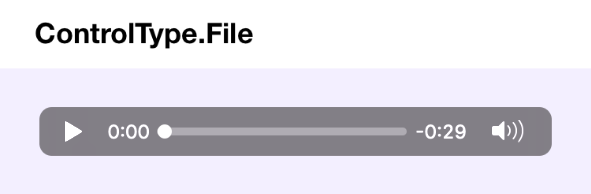
Playing audio in HTML isn’t difficult, you just use an <audio> element, which will display a standard HTML5 audio player.
  render() {
    return (
      <div style={divStyle}>
        <audio
          autoPlay={false}
          loop={false}
          muted={false}
          controls={true}
          preload="auto"
          style={{
            width: "325px"
          }}
          src={this.props.audiofile}
        />
      </div>
    );
  }
Multiple files
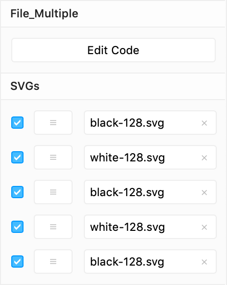
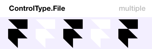
In this multi-file example, you can add illustrations in SVG format that will be displayed inside the component.
For the TypeScript type: ‘an array of strings’.
interface Props {
  svgs: Array<string>;
}
We can’t add default files upfront, but we know they will be in an array: []
  static defaultProps = {
    svgs: []
  };
I have set the maxcount to 5 SVGs.
  static propertyControls: PropertyControls = {
    svgs: {
      type: ControlType.Array,
      title: "SVGs",
      propertyControl: {
        type: ControlType.File,
        allowedFileTypes: ["svg"]
      },
      maxCount: 5
    }
  };
And in the render() function I run all URLs in the this.props.svgs array through map(), and set them as the src of an <img>. (The easiest way to display an SVG in a web browser.)
  render() {
    return (
      <div style={divStyle}>
        {this.props.svgs.map((url, index) => (
          <img key={index} src={url} style={imageStyle} />
        ))}
      </div>
    );
  }
Boolean
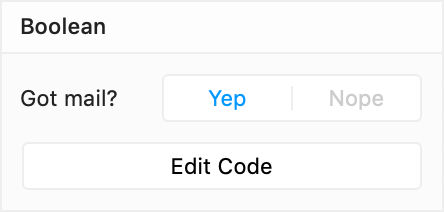
A Boolean can only be one of two values: true or false, so a big switch is shown in the UI.
The TypeScript type: a boolean.
interface Props {
  check: boolean;
}
The default value for our check property can be either true or false.
  static defaultProps = {
    check: true
  };
The words ‘True’ and ‘False’ will also be displayed in the UI unless you change them by setting the enabledTitle and disabledTitle. Here I picked "Yep" and "Nope".
  static propertyControls: PropertyControls = {
    check: {
      type: ControlType.Boolean,
      title: "Got mail?",
      defaultValue: true,
      enabledTitle: "Yep",
      disabledTitle: "Nope"
    }
  };
ControlType.Boolean
| Property | Type | Required |
|---|---|---|
title | String | – |
defaultValue | Boolean | – |
enabledTitle | String | – |
disabledTitle | String | – |
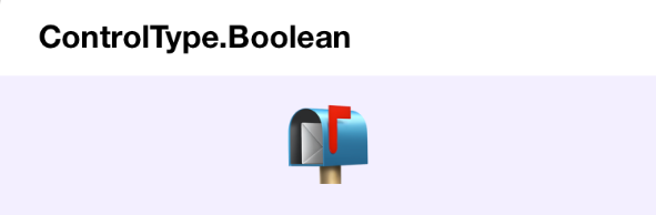
In the render() function I just show a 📬 emoji when this.props.check is true, and a 📭 when it isn’t.
  render() {
    return <div style={divStyle}>{this.props.check ? "📬" : "📭"}</div>;
  }
The single line expression above, this.props.check ? "📬" : "📭", uses the JavaScript ternary operator, which is a concise way of writing an if…else statement.
It’s the same as this:
if (this.props.check) {
  // show one emoji
} else {
  // show the other emoji
}
But you can’t put all of that between JSX’s { brackets }, which means you would have to do something like this:
  render() {
    let emoji;
    if (this.props.check) {
      emoji = "📬";
    } else {
      emoji = "📭";
    }

    return <div style={divStyle}>{emoji}</div>;
  }
… which just isn’t so nice and clean. (More info)
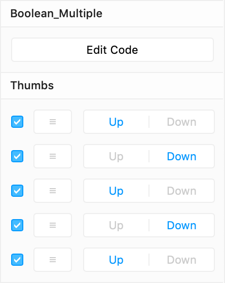
Multiple Boolean values
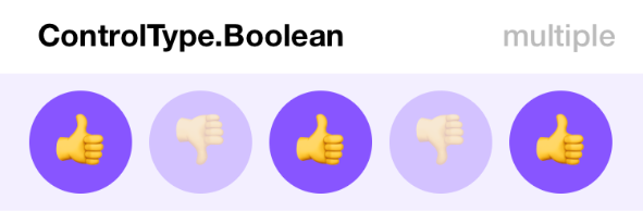
In this example, the component displays a row of thumb emojis that are either ‘Up’ or ‘Down.’
The TypeScript type: not just one boolean, but an Array of them:
interface Props {
  thumbs: Array<boolean>;
}
Setting some yeses and nos as default values.
  static defaultProps = {
    thumbs: [true, false, true, false, true]
  };
Instead of ‘False,’ I want to see "Up" as the enabledTitle, and "Down" as the disabledTitle.
The maximum number of Booleans, maxCount, is set to 5.
  static propertyControls: PropertyControls = {
    thumbs: {
      type: ControlType.Array,
      title: "Thumbs",
      propertyControl: {
        type: ControlType.Boolean,
        defaultValue: true,
        enabledTitle: "Up",
        disabledTitle: "Down"
      },
      defaultValue: [true, false, true, false, true],
      maxCount: 5
    }
  };
The render() function returns a <div> (with a divStyle) that contains smaller <div>s (with a swatchStyle). And when the thumb in question is false the opacity is set to 0.3.
  render() {
    return (
      <div style={divStyle}>
        {this.props.thumbs.map((thumb, index) => (
          <div
            key={index}
            style={{
              ...swatchStyle,
              opacity: thumb ? 1 : 0.3
            }}
          >
            {thumb ? "👍" : "👎"}
          </div>
        ))}
      </div>
    );
  }
Enum
With an Enum (short for enumeration) you can present a list of options to the user.
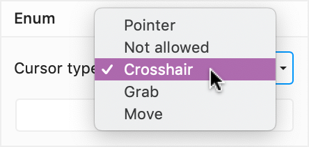
In this example I let the user pick which cursor should be shown (instead of the default pointer) when you hover over a button.
Surprisingly, TypeScript expects a list of possible options as the type description, so I give it a list of five possible CSS cursor values.
interface Props {
  cursor: "pointer" | "not-allowed" | "crosshair" | "grab" | "move";
}
By the way, a ControlType.Enum expects string values, so if you want to use numbers, turn them into strings, e.g., "1" | "2" | "3" …
As the default value for my cursor property, I pick one of them: "pointer".
  static defaultProps = {
    cursor: "pointer"
  };
By setting another array of strings on optionTitles I’ll have more nicely formatted labels in the UI.
  static propertyControls: PropertyControls = {
    cursor: {
      type: ControlType.Enum,
      title: "Cursor type",
      options: ["pointer", "not-allowed", "crosshair", "grab", "move"],
      optionTitles: ["Pointer", "Not allowed", "Crosshair", "Grab", "Move"]
    }
  };
(Naturally, both the options and optionTitles arrays should contain the same number of items.)
ControlType.Enum
| Property | Type | Required |
|---|---|---|
title | String | – |
options | Array of strings | ✔️ |
optionTitles | Array of strings | – |
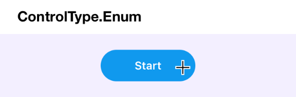
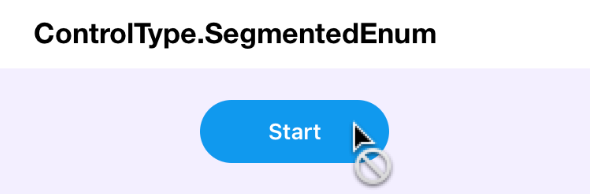
In the return() function I simply set the CSS cursor property of the <button> to the value of this.props.cursor.
  render() {
    return (
      <div style={divStyle}>
        <button
          style={{
            ...buttonStyle,
            cursor: this.props.cursor
          }}
        >
          Start
        </button>
      </div>
    );
  }
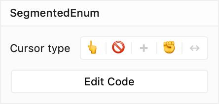
Segmented Enum
This one is the same as an Enum, but with the options presented next to each other, in a segmented control instead of in a pop-up list.
Naturally, you can use this control with maximum four, maybe five options. When you have more options, you better use an Enum. If you have only two, use a Boolean.
Just as with an Enum, TypeScript expects a list of possible options as the type description. I give it a list of five possible CSS cursor values.
interface Props {
  cursor: "pointer" | "not-allowed" | "crosshair" | "grab" | "move";
}
As the default value for my cursor property, I pick one of them: "pointer".
  static defaultProps = {
    cursor: "pointer"
  };
When your options do not fit in the segmented control, you’ll want to set shorter optionTitles for use in the UI.
(Naturally, both the options and optionTitles arrays should contain the same amount of items.)
  static propertyControls: PropertyControls = {
    cursor: {
      type: ControlType.SegmentedEnum,
      title: "Cursor type",
      options: ["pointer", "not-allowed", "crosshair", "grab", "move"],
      optionTitles: ["👆", "🚫", "✚", "✊", "↔"]
    }
  };
ControlType.SegmentedEnum
| Property | Type | Required |
|---|---|---|
title | String | – |
options | Array of strings | ✔️ |
optionTitles | Array of strings | – |
Pro tip: When using a few predefined strings (e.g. "Left", "Center", "Right",..) in optionTitles you’ll get icons in the UI. More info in this post by Steve Ruiz.
The code below is exactly the same as in the Enum example. I merely set the CSS cursor property of the <button> to the value of this.props.cursor.
  render() {
    return (
      <div style={divStyle}>
        <button
          style={{
            ...buttonStyle,
            cursor: this.props.cursor
          }}
        >
          Start
        </button>
      </div>
    );
  }
Fused Number
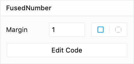
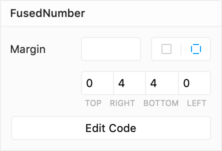
You’ll recognize this control from Framer’s Properties Panel. It’s how you set a frame’s radius or border width.
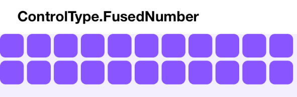
This control has two modes. You can set one numeric value for all sides:
… but it also has a mode in which you can set separate values for each of the four sides (or corners, or whichever set of four things you devise):
Naturally, this is the most complicated control to set up.
It doesn’t just use one property, but six.
- A
numberfor the main (unfused) value, the value for all sides. Here I named itmargin; - four
numbervalues for the distinct sides. I pickedmarginTop,marginRight,marginBottom, andmarginLeft; - and a
booleanto toggle between the two modes. I named itmarginPerSide.
interface Props {
  margin: number;
  marginPerSide: boolean;
  marginTop: number;
  marginRight: number;
  marginBottom: number;
  marginLeft: number;
}
Below are their default values. I’ve set marginPerSide to false. So when you drag the component to the Canvas, the initial mode will be: ‘one single value for all sides’.
  static defaultProps = {
    margin: 1,
    marginPerSide: false,
    marginTop: 0,
    marginRight: 4,
    marginBottom: 4,
    marginLeft: 0
  };
Then, the property control itself:
  static propertyControls: PropertyControls = {
    margin: {
      type: ControlType.FusedNumber,
      title: "Margin",
      toggleKey: "marginPerSide",
      toggleTitles: ["All Sides", "Per Side"],
      valueKeys: ["marginTop", "marginRight", "marginBottom", "marginLeft"],
      valueLabels: ["Top", "Right", "Bottom", "Left"],
      min: 0
    }
  };
On toggleKey you set the name of the Boolean that you’re using to toggle between the two modes. (Written as a string, though, so "marginPerSide" instead of marginPerSide.)
And valueKeys should contain the names of the properties for the separate sides, in the order that you want to see them in the UI.
The valueLabels will be displayed under those four fields. (Make them as short as possible, there isn’t a lot of space.)
The toggleTitles are only visible as tooltips when you hover over the little segmented control on the right.
I’ve set min to 0, so only positive numbers can be entered.
ControlType.FusedNumber
| Property | Type | Required |
|---|---|---|
title | String | – |
toggleKey | String | ✔️ |
toggleTitles | Array of 2 strings | ✔️ |
valueKeys | Array of 4 strings | ✔️ |
valueLabels | Array of 4 strings | ✔️ |
min | Number | – |
In this example, I’m using the control to define the CSS margin for a bunch of little <div>‘s. So I’ll be setting their global margin property or separate properties for the four distinct sides.
In the render() function, I first create an object in which I want to save the CSS properties, marginProperties. It’s a let variable because I have to be able to change it.
When this.props.marginPerSide is true, I save the margins for the separate sides in it, and when not I just give it the one global margin value.
  render() {
    let marginProperties = {};

    if (this.props.marginPerSide) {
      marginProperties = {
        marginTop: this.props.marginTop,
        marginRight: this.props.marginRight,
        marginBottom: this.props.marginBottom,
        marginLeft: this.props.marginLeft
      };
    } else {
      marginProperties = {
        margin: this.props.margin
      };
    }

    let swatches = [];
    for (let i = 0; i < 22; i++) {
      swatches.push(
        <div
          key={i}
          style={{
            ...swatchStyle,
            ...marginProperties
          }}
        />
      );
    }

    return <div style={divStyle}>{swatches}</div>;
  }
With a for loop, I create 22 swatches, little <div>s.
They all have the same styling: the CSS properties that were already contained in swatchStyle, combined with the marginProperties.